top of page


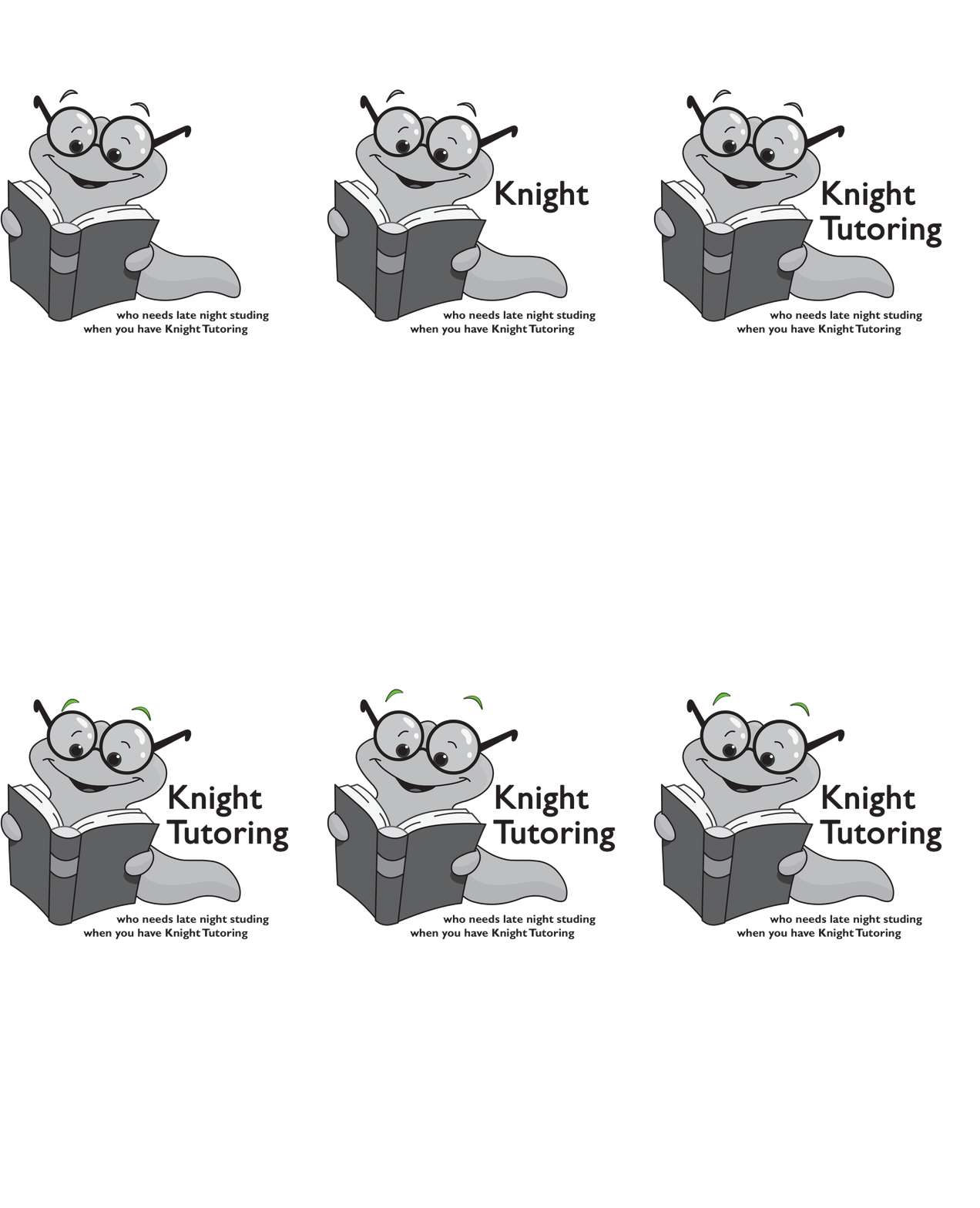
I chose to make Knight Tutoring my company by inspiration from SparkNotes. SparkNotes is a program that several students, such as myself, use to help them in their school work while Knight Tutoring expands on that same concept. The logo I created with a book worm ties into my company's identity because it looks professional, but not too serious. The same goes for the font I chose except for the one on the envelope except I believe that it looks more inviting. Now, on to the color palette, the colors chosen are simplistic while still bright and eye catching. I do believe that all five pieces of this assignment do match. To make sure of that I used the same font, logo, and color palette in all five of those pieces. My biggest struggle during this project was making the eyebrows of my book worm in the gif move up and down. On the other hand, my favorite part of the project was designed the original logo in the first place.
bottom of page