top of page


Drawing Exercises
So far I like illustrator more than photoshop. This is due to the fact that it fixes your mistakes as you go along and is easier to understand. My favorite object I drew would have to be the fish. It is the fish because I think it is cute and has a good color palette. On the other hand, my worst object is the book, if you can even tell if that's what it is. Since my work deleted after the first day I do not have a ladybug.
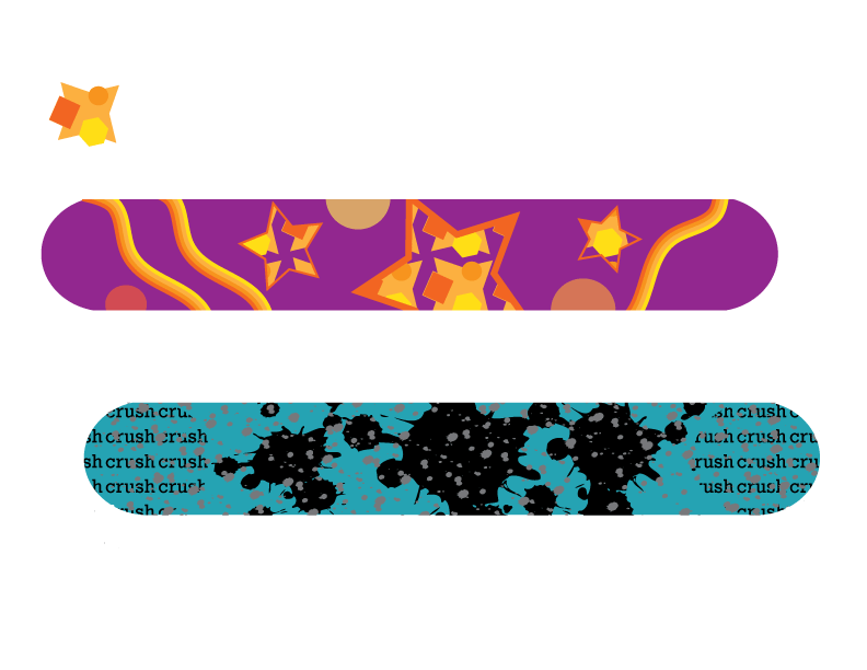
Snowboard Designs
Out of the two snowboards I designed my favorite would have to but the second, or blue one. This is because I like the simplicity, splatter paint look, color, and words. I did indeed enjoy making a custom brush along with making a custom pattern. I customized the symbols I used but morphing their size and shape, repeating them, and changing their colors.


Musician Poster
I am pleased with how my portrait of Lauren Daigle turned out because of the detail. On the other hand, I could have done better with the hair and headband color. Even with the colors of the hair and headband, I do believe that this musician poster does look like Lauren Daigle. Personally, I prefer to use Illustrator vector graphics because the auto corrects your mistakes. The poster does look legitimate thanks to how I used my text. The size and placement of the text make it look professional. While the color scheme allows it to pop. I made ut pop or stand out by having multiple colors including the shadows.
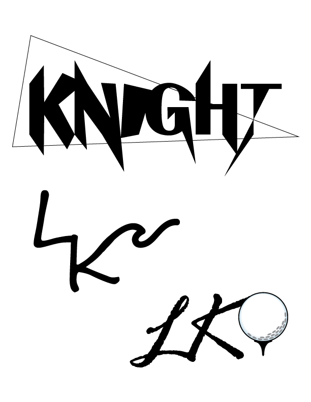
Logos Designs
My three logos include a lettermark logo and two combination mark logos. I personalized each logo by having editing the golf ball colors, changing the way the letters look, and hand drawing the wave. I did like working in black and white because it made the combination mark logos easier to blend together. I chose to use a golf ball and wave as my graphics because I will play golf in the spring and love the beach. My favorite logo that I made would have to be the one with the wave because it flows so smoothly. While one the other hand, my least favorite logo would have to be the one with the golf ball due to the fact that it does not flow smoothly.

Art Palette Logo
For my art palette logo I started by removing all color from the image and deleting pieces of it. Once I did that I decided what colors I wanted to include. After that I curved the text around the palette using the type on a path tool. Then I added the paint splat element to the logo and brought it behind everything else. Lastly i picked out the font and colors for the word art and included a black shadow in the same font.
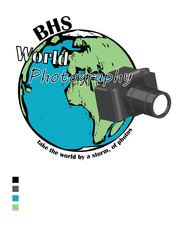
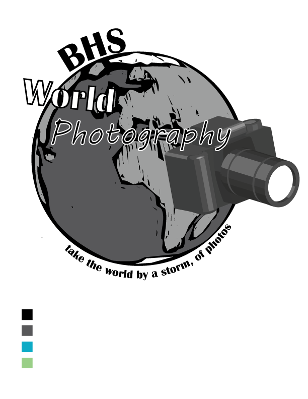
Crazy Class Logo
I chose to use a camera and Earth graphics in my logo for the class World Photography. They represent my class because you take photos with a camera and I used an image of the world. I combined the images by making it look like the Earth was taking a picture. To make the text a part of the design I put text directing on the graphic along with wrapping text around it. My favorite piece of the logo is the color scheme. A weak area in my logo would have to be the font and placement of the word photography.
bottom of page